11 Feb How To Choose The Best Colour For A Restaurant
 One of the human brain’s roles is to facilitate foraging and feeding. And because research has demonstrated the profound effect visual perception has on the ‘hungry’ brain, in the food & hospitality industry, colour isn’t just an arbitrary choice. The choice of the logo, brand colours and both interior and exterior colours has to be done with thoughtful deliberation of colour theory. How do you go about selecting your restaurant colours? What colours are the most appetizing? Your menu, the cultures of your target customers, and the brand image you want to create should all guide you.
Health Food Restaurants
If yours is a health food restaurant, you want vivid natural colours that are close to those found in nature. Browns and greens and earthy tones that denote health and nature. You will notice that most vegan restaurants have shades of green to convey health. A calm tone of green on the walls will make your customers relaxed and encourage them to stay longer. This does not mean that you should paint your whole restaurant green. You can pair green with other light hues and hints of woody brown. While green and other earth tones may work well for restaurants offering healthy menus, it will not work well for dimly lit bars and meat-based restaurants.
Upscale Restaurants and Bistros
Light colours evoke a leisurely and relaxing atmosphere. If you’re setting up an upscale restaurant, you’ll want to consider light hues like ivory, white, beige, and light grey. The soft colours will encourage your guests to relax and hopefully order an appetizer, main course, and then stay a while longer for dessert and coffee. Because they invoke relaxation, you will not want to use light hues for quick service eateries that depend on high turnover for their profits.
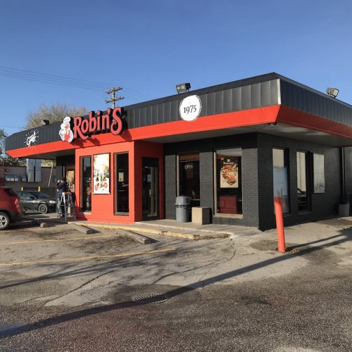
High-volume Restaurant
In a high-volume restaurant, you want a lot of customers who come in to ‘eat and run’. You want colours that are bright and exciting and that provide a lot of stimulation but also become irritating after a long period. Reds, oranges, yellows, and golds do exactly this – they pull guests in but after a while of stimulation, your guests will want out which is exactly what you need in a restaurant that depends on volume. A note however is: you shouldn’t overdo these colours, otherwise they’ll end up repelling guests- there’s the right way to do it.
Romantic Restaurants
To create an intimate atmosphere, dark colour schemes are an excellent choice. Rich shades of brown, crimson, purple, navy and green will work well. You should be careful though not to use too many dark shades as this will make your restaurant feel cramped and claustrophobic. You can choose one dominant rich colour then blend that with lighter hues of complementary colours so the restaurant doesn’t feel dull.
Restaurant interior design aims to tap into the diners’ senses just right. Successful restaurant owners know who their target customers are, and they use this information to engineer experiences around their needs and desires. Our Winnipeg painting contractors can work with you to come up with a colour scheme that’s most ideal for your clientele type.