16 Jun Top Three Trending Office Colours for 2020
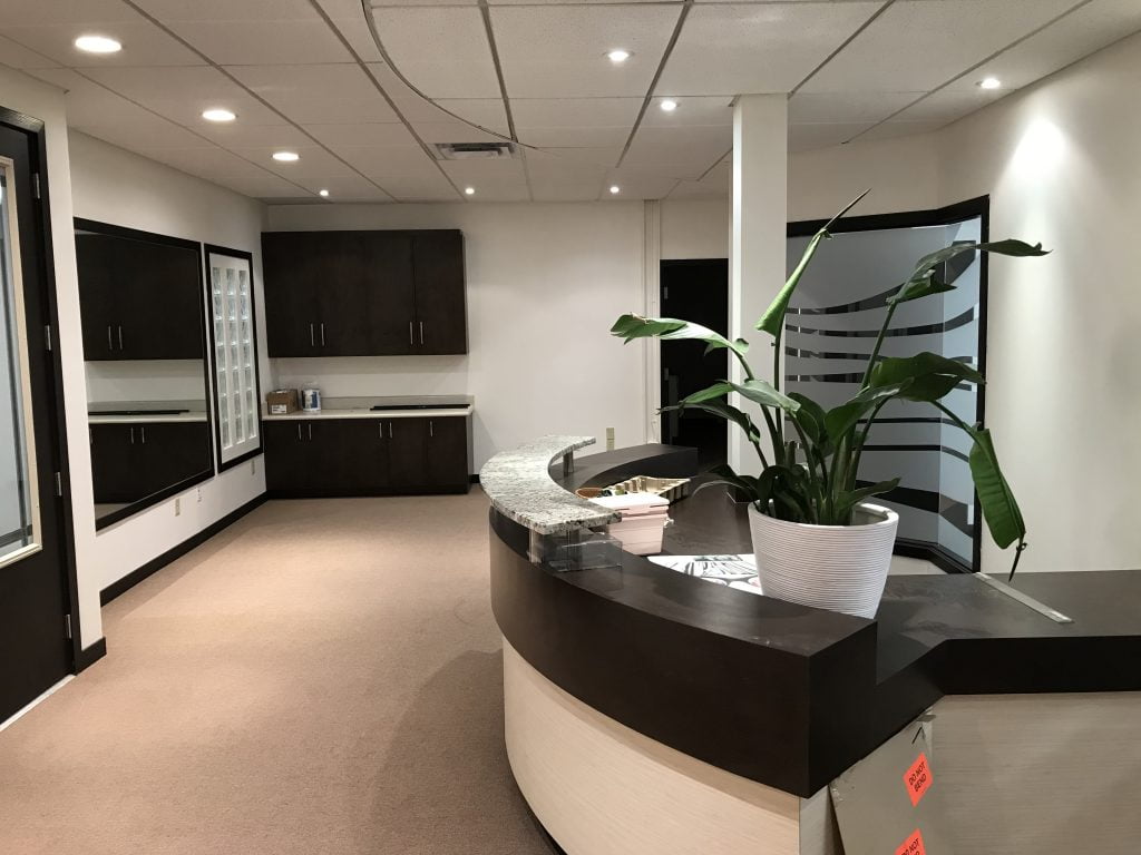 Now that employees are returning to work, it seems like a good time for an office revamp. While you’re deep cleaning the workspace, why not add a fresh layer of paint to the walls? A new wall colour refreshes a tired space – it might even boost worker productivity.
Choosing a new paint colour requires careful foresight. There’s nothing worse than a workspace with distracting walls – it impedes the ability to focus. Want to make sure that you select the right colour for your office? We’ve compiled the three trendiest colours for offices in 2020. Consider changing the colour of your workspace, and you may notice a difference in the atmosphere of the office. Let’s skip the boring shades of beige or off-white and go over the top three trending office colours for 2020.
1) Sunset orange. Imagine the colour of a creamsicle. Now imagine the bland walls of your office space. Put those two images together, and you have one exciting new workspace. Orange can be an intense colour by itself, but when it’s diluted to a soft sunset tone, it creates a relaxing atmosphere. White walls feel clinical, so try adding a warmer colour to brighten up the room. A warm, sunset orange is a unique colour for an inviting, yet serious workspace. It will be a dramatic change, but a welcome one. Be sure to select a tone that compliments the other furniture and decorations in your office. For example, an office with blue couches will look especially trendy with orange walls.
2) Periwinkle. A mix between cool grey and soft blue, periwinkle makes a great addition to any workspace. Its comforting cool tones provide a calm space to work in. The grey undertones create a colour that isn’t too intense, and soothes, rather than distracts employees. Instead, periwinkle has a slight kick of colour, but it borders on being a neutral tone. Coating your walls with a layer of periwinkle paint will create an office that’s tranquil, yet productive. This trendy colour pairs nicely with a range of complimentary colours. Some accents to consider would be grey or yellow.
3) Champagne. No, we’re not talking about happy hour – consider painting your walls the same colour as your favourite sparkling drink. Champagne provides a nice, neutral base, while still adding a hint of warmth. Its pink undertones will give the space depth and intimacy instead of sterility. Offices with champagne walls will feel cutting-edge. It’s a unique colour that appears subtle, but it actually enhances the natural shape of a room. The greatest advantage to champagne is that it pairs well with almost anything, and it’s warmer than a grey wall. Champagne walls look best with brown or beige decorations. For an extra pop, try decorating the office with metallic colours, like silver or rose-gold.
Has this list inspired you to break out your paintbrush? Save yourself the dirty work and call Pinnacle Painting, instead. We offer commercial painting services in Winnipeg and we can help you pick the perfect colour for your office and paint it perfectly, too.